DEFAULTS:
flex-grow: 0;
flex-shrink: 1;		Allows flexbox to shrink elements as needed.
flex-basis: auto;
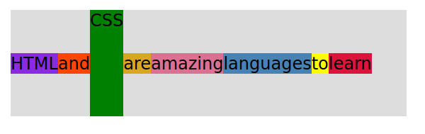
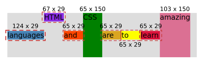
Instead of using the width property in flex, we use flex-basis. As shown in the following picture, if I set the flex-basis to 65 pixels, then flex automatically sizes each word to 65 pixels (with a height of 29 or 150 pixels), except for languages, HTML, and amazing which needed more than 65 pixels to begin with.
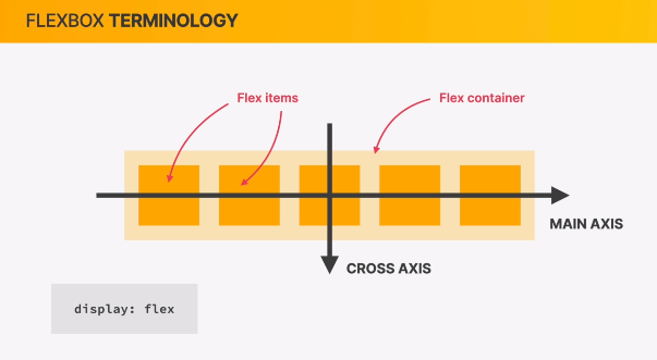
- The browser will figure out the optimal length.
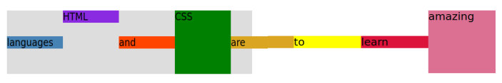
- Flexbox is allowed to shrink elements to fit the container. For example, you write “flex-basis: 200px;” but there is only space for each element to have 140 pixels each, so that is what will show in the browser.
If we:
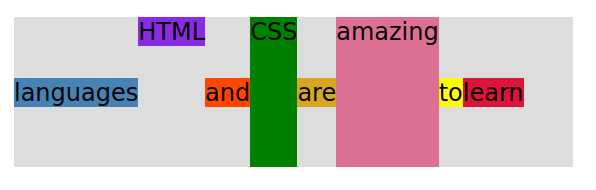
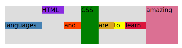
flex-basis: 150px;
flex-shrink: 0;
Now each element is 150 pixels wide, but now because the flex-shrink is set to 0 (and flex is not allowed to adjust elements), but the content no longer fits the container.
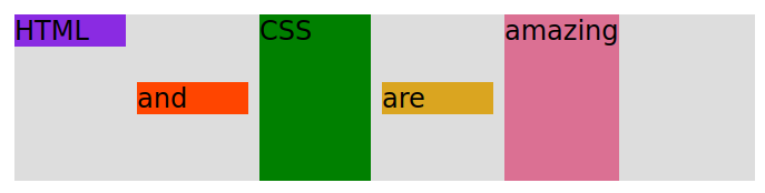
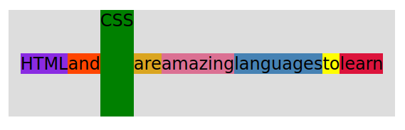
flex-grow: 1; It seems that there is equal space after all of the words.
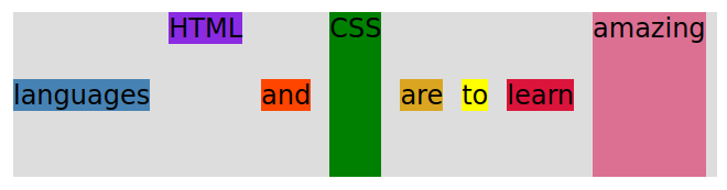
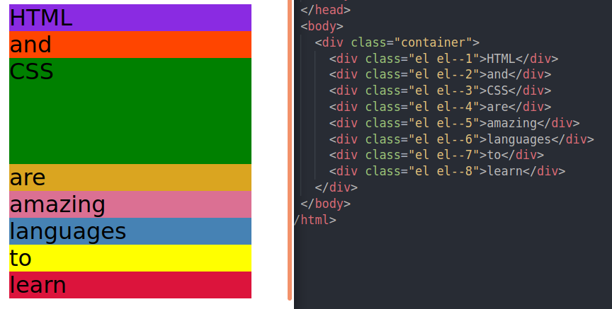
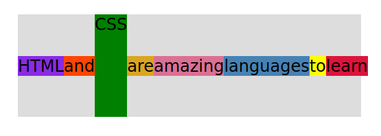
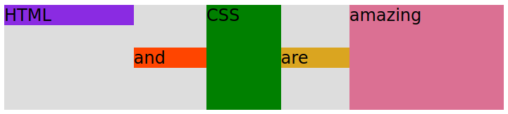
You can even set different growth sizes, and flex will even it out. After taking out the order and shortening the sentence to “HTML and CSS are amazing”.
To do that you would need flex-grow on two different elements.
| flex-grow: 1; | would be normal, actually it doesn’t have to be “1”. It just has to be the same number. If all of your flex-grow has the same number, like “5”, they would all be the same size. |
| flex-grow: 2; | would have double the extra space after the word “HTML” and amazing compared to the other words. |
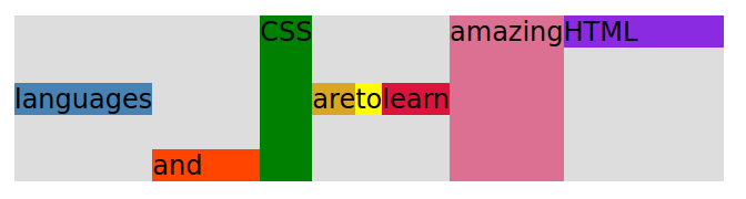
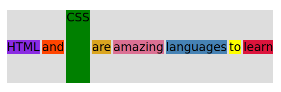
We can still have a gap in between:
gap: 10px;
For the following example I turned off all of the flex-grow in the individual elements.
flex property shorthand (with default values):
flex-grow: 0; flex-shrink: 1; flex-basis: auto;
You write the shorthand like this if you want flex-grow(0); flex-shrink(0); and flex-basis(100px);:
flex: 0 0 100px;