
If you have a lot of divs or paragraphs before you define flexbox it might look like this:
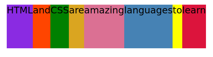
Adding the following to the container changes the above to this:
.container {
  display: flex;
}
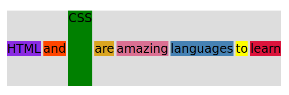
Everything is now side by side with no extra spaces. Everything vertically is as tall as the tallest element, which is the CSS green color (which height was set to 150px in the style section). If no height was assigned, then the colors would only occupy the space necessary around the letters or content.
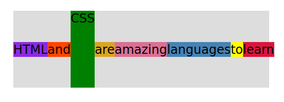
One of the most powerful things in flexbox is the centering.
font-family: sans-serif;
background-color: #ddd;
font-size: 34px;
margin: 40px;
display: flex;
align-items: center;
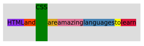
There are also:
align-items: flex-start; (the saying would be at the top of the gray background-color)

align-items: flex-end; (the saying would be at the bottom of the gray background-color)

align-items: stretch; (is the default value. So all of the items will stretch as tall as the tallest element, like the first example shown.)
justify-content: center; (now the saying is centered, left side and right side, between the gray background color)
justify-content: space-between; (now there is equal spaces between all of the words.)