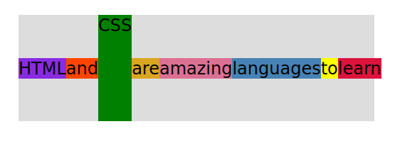
display: flex;
align-items: center; *
justify-content: flex-start; * (This is the default. As you can see everything is pushed to to left margin.)
* Two of the most important properties that apply to the flex container. Another one is gap.
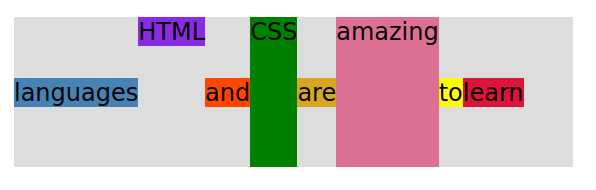
Sometimes you want each element on a different line, not just in the center as defined with (align-items: center;) So, you would use (align-self: ; ) to do that.
By default everything is at the 0 position, so if you want to move something to the front of the line:
order: -1;
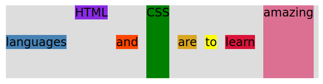
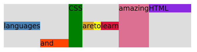
| .el – -1 { | HTML |
| align-self: flex-start; | default, pushed to top of container |
| } | |
| .el – -5 { | amazing |
| align-self: stretch; | stretch to entire width of container |
| } | |
| .el – -6 { | languages |
| order: -1; | order: -1: pushes it to the beginning before 0 |
| } |
| .el – -1 { | HTML |
| align-self: flex-start; | default, pushed to top of the container |
| order: 2; | order 2: is after 0 and 1, so it is at the end of the line |
| flex-grow: 3; | gets wider- grows relative to the rest of the flexible items inside the same container. |
| } | |
| .el – -2 { | and |
| align-self: flex-end; | pushed to the bottom of the container |
| flex-grow: 2; | gets wider- grows relative to the rest of the flexible items inside the same container. |
| } | |
| .el – -5 { | amazing |
| align-self: stretch; | stretch to entire width of container |
| order: 1; | after order 0 and before order 2, or 3, 4, etc. |
| } | |
| .el – -6 { | languages |
| order: -1; | pushes it to the beginning space before order 0 |
| } |
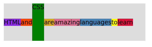
.container {
  display: flex;
  align-items: center;
  justify-content: flex-start;
  gap: 17px;
}
Tip: gap puts space or a “gap” equal distance between your items. It eliminates having to use the margin-right: 1em; and then having to remove the margin-right space after your last item.