Developer Skill #1: Googling and Reading Documentation

Developers never know everything, they just know when something exists, and also know how to look it up.

For example, say you wanted to find out how to search for the cursor that changes to a hand when you hover over a button. You might type something like: (in the search bar)

“css property to add mouse cursor to button”

In stackoverflow.com you will find that you can just put button {cursor: pointer;} into your css code.

OR

“css how to center anchor elements” OR go more specificly to “mdn css text align”

In stackoverflow.com you will find that the answer is to add the text-align property (text-align: center;) to its parent style attribute

developer.mozilla.org is a good reference resource for developers. Mdn explains and gives examples to test, which is always a good thing.

Posted in Web Developer Course | Tagged , , , , , | Leave a comment

Pseudo-elements

Tip: Pseudo-classes are with one colon. Pseudo-elements are written with two colons. By default, any pseudo-element is an inline element.

Example to un-italicize and give some space to a book emoji in a h1 element:

h1::first-letter {
  font-style: normal;
  margin-right: 5px;
}

Another good use is to make only the first letter font bigger:

h3::first-letter {
  font-size: 80px;
}

If you want all of your first-lines of ALL your paragraphs to be a different color then the rest of the paragraphs:

p::first-line {
  color: red;
}

Tip: to choose the “adjacent sibling selector”, for example, to choose the only the FIRST paragraph that comes after ALL of the h3’s in the document. It ignores the 2nd, 3rd, 4th paragraphs, etc.

h3 + p::first-line {
  color: red;
}

In CSS you can add more content without writing anything in HTML. The following will add the word “Top” to the end of your written h2 element. It will add it without any spaces, and will keep font-size, color, etc. of original h2 element.

h2::after {
  content: “Top”;
}

To make a stand alone item, like a “Top News Story” or “New” or “Price Lowered” for a h2:

Tip: remember to position your h2 to relative, so that the absolute position in the pseudo-element works. Like so:

h2 {
  position: relative;
}

h2::after {
  content: “TOP STORY”;
  background-color: yellow;
  color: black;
  font-size: 16px;
  font-weight: bold;
  display: inline-block;
  padding: 5px 10px;
  position: absolute;
  top: -10px;     (Negative numbers put the item above the top, outside of the block.)
  right: -25px;   (Negative numbers put the item to the right, outside of the block.)
}
Posted in Web Developer Course | Tagged , , , , , , , , | Leave a comment

CSS Theory #5: Absolute Positioning

To get a button to be always at the bottom right side of your page you need to:

(example of a button)

	button {
	  font-size: 22px;
	  padding: 20px;
	  cursor: pointer;
	  position: absolute;
	  bottom: 50px;
	  right: 50px;
	}

(And also change the body or the container you want your button to be in to relative, otherwise the button will be absolutely be positioned on the view port screen, for example, in the above instance it will be seen in the bottom right corner of the screen you see and will be on top of anything else there, and will scroll up with the page.) So, you need to add:

	body {
	  position: relative;
	}

Use absolute positioning for single elements like buttons or other small items.

Posted in Web Developer Course | Tagged , , , , , | Leave a comment

CSS Theory #4: Types of Boxes

Inline Elements: only occupy the amount of space they need for its content and nothing more. They can be side by side with one another.

  • Occupies only the space necessary for its content.
  • Causes no line-breaks after or before the element.
  • Box model applies in a different way: heights and widths do not apply.
  • Paddings and margins are applied only horizontally (left and right).
  • Default elements: a, img, strong, em, button, etc.
  • With CSS: display: inline;

Block Level Elements: occupy all the space they can and create line break spaces after them.

  • Elements are formatted visually as blocks.
  • Elements occupy 100% of parent element’s width, no matter the content.
  • Elements are stacked vertically by default, one after another.
  • Default elements: body, main, header, footer, section, nav, aside, div, h1-h6, p, ul, ol, li, etc.
  • With CSS: display: block;

Inline-Block Elements:

  • Looks like inline from the outside, behaves like block-level on the inside.
  • Occupies only content’s space.
  • Causes no line-breaks.
  • Box-model applies as showed.
    • You can still set heights and widths, and use margins and paddings.
  • With CSS: display: inline-block;
  • Works great with adding space around anchor tags with links placed side by side.

You can chain two sudo classes (link and last-child) together without any problem. The following shows how to remove the margin-right spaces from your last made navigation:

nav a:link {
    margin-right: 30px;
    margin-top: 10px;
    display: inline-block;
}
nav a:link:last-child {
	margin-right: 0;
}

Posted in Web Developer Course | Tagged , , , , , | Leave a comment

Section 3, Challenge #2

Using our Converse Shoes code, time to practice the things that we have learned.

  • Resetting the universal selector to zero.
  • Use width to give a desired product width.
  • Use margin: 50px auto; to center your page and give some space on the top.
  • Use padding to fatten out your background color in your title.
  • Using margin-bottom to give spacing between words and pictures.
  • Sometimes you have to use margin-top to give spacing.

FYI margin-bottom does not work on links.

  • To get space in a list, you need to target the li itself:
	.details-list li {
	    margin-bottom: 10px;
	}
  • If you want a button to span the width of the page, be padded, and have a top border when the button is hovered:
	width: 100%;
	padding: 15px;
	border-top: 4px solid black;
Posted in Web Developer Course | Tagged , , | Leave a comment

Centering our Page

Steps to center a page:

  • have or make a container and give it a width.
HTMLCSS
<div class=”container”>.container {
width: 800px;
}
</div>
  • set margin-left and right to auto, so that the width is automatically placed and there will be a margin on the left and on the right which will be exactly the same size.
	width: 800px;
	margin-left: auto;
	margin-right: auto;
  • better yet, use the margin shorthand. Top and bottom=0, and left and right=auto:
	margin: 0 auto;
  • you can even put a percentage on the width, to adjust to different sizes of screens:
	width: 80%;

Posted in Web Developer Course | Tagged , , , | Leave a comment

Adding Dimensions

To make a sidebar you can add a width:

width: 500px;

If you have an image, for example, you can use a percentage. 100%, would be 100 percent of the parent container (i.e. computer screen, tablet screen, or phone screen). Great when you are building websites that adapt to the screen width.

.author-img {
    width: 100%;
    height: auto;
}

Use “auto” in CSS if you have a width or height that you want to keep the aspect ratio, and you have width and height numbers in your HTML file. CSS will overwrite your HTML numbers.

Posted in Web Developer Course | Tagged , , , | Leave a comment

Margins and Paddings

Padding shorthand in CSS:

  • Four values: starts at the top, then right side, bottom, then left side.
  • Three values: first number is top, second number is right and left, third number is bottom.
  • Two values: first number is the value for the top and bottom padding, and the second value will be for the left and right sides.
    • padding: 20px 40px;
  • One value, it will be the same on all four sides.

Many developers when they begin a new project always reset the universal selector to 0. That way they can design their website how they want, without the browser defaults. Like so:

*  {
    margin: 0;
    padding: 0;
}

Helpful hint:

Use margin-bottom or margin-top to put extra space between elements. Use one or the other (either bottom or top every time you create a site), but not both, so you can have better control over your design.

Collapsing margins – happens when a margin is given below an element, and a margin is given above an element which are next to each other. The margin is collapsed to the biggest margin given between them, not adding the two margins together. For example, if the top element has a bottom margin of 20 pixels, and the lower element has a top margin of 40 pixels, there will only be 40 pixels between the two elements.

Posted in Web Developer Course | Tagged , , , | Leave a comment

CSS Theory #3: The CSS Box Model

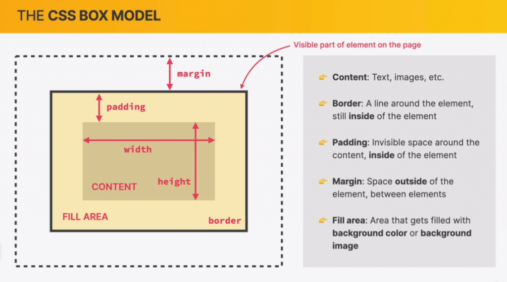
Default behavior calculation:

Final element width = left border + left padding + width + right padding + right border

Final element height = top border + top padding + height + bottom padding + bottom border

Margin = empty space to separate one element and from another. It is not included in the final element’s width or height.

Posted in Web Developer Course | Tagged , , | Leave a comment

Section 3 – Challenge #1

CSS elements used:

background-color: #f7f7f7; (light grey background)

border: 4px solid black;

color: #777; (dark grey text color)

cursor: pointer; (changes arrow mouse cursor to a hand pointer to click a button or link)

font-family: sans-serif;

font-size: 22px;

font-weight: bold;

line-height: 1.4;

list-style: square; (makes list bullet-points square)

text-align: center;

text-decoration: none; (removes underline under links)

text-transform: uppercase; (makes all letters uppercase)

************************************

I also used a class. Remember to use pseudo-classes (link, visited, hover, and active). More than one thing can be grouped together with a comma when you want to use the same properties:

.more-info:link, .more-info:visited {
    color: black; (to change the text black instead of the default blue color)
}
.more-info:hover, .more-info:active {
    text-decoration: none;
}

Also, don’t forget in the HTML to link to the CSS with:

<link rel=”stylesheet” href=”style.css” />

Posted in Web Developer Course | Tagged , , , , | Leave a comment